The Definitive MoonSwatch Ranking: From Stellar to Subpar
- Mar 18, 2025
- 5 min read
Updated: Jul 5, 2025
The Swatch x Omega Bioceramic MoonSwatch collaboration has redefined the watch industry landscape since its 2022 debut. More than just boosting sales—Omega's original Speedmaster sales jumped by an impressive 50%—this partnership has fundamentally changed how enthusiasts and casual consumers alike engage with watches.
What began as 11 distinct "Missions" (representing the Sun, Moon, eight planets, and Pluto) has evolved into an expanding universe of variants, both limited and permanent additions. I've taken on the admittedly subjective task of ranking every MoonSwatch released to date, from the most captivating to the least inspiring.
The Elite Tier
#1: Mission to Mars

Perhaps the most controversial top pick, but the Mission to Mars has earned its place through near-unanimous acclaim among watch enthusiasts. Part of the original collection, it stands out with its striking red case contrasted against crisp white accents. Its design draws inspiration from the legendary "Alaska Project" Speedmaster, featuring distinctive rocket-shaped sub-dial hands and luminous sub-dials that pay homage to that coveted model.
#2: Mission to Moonphase (The Snoopy Edition)

Just as the MoonSwatch phenomenon seemed to be cooling, Swatch reinvigorated interest with the March 2024 release of the Mission to Moonphase. This model introduced several firsts: the inaugural all-white colorway, the first non-chronograph complication (a moonphase display), and most notably, the first MoonSwatch featuring Snoopy—NASA's beloved safety mascot who has adorned some of the most sought-after Speedmasters in history. As the first journalist worldwide to examine this model hands-on, I can confidently say it's my personal favorite in the collection.
#3: Mission to the Moon

The Mission to the Moon earns its bronze medal by staying closest to the original Omega Speedmaster Professional Moonwatch. While perhaps less visually striking than our gold and silver medalists, its faithful interpretation offers an uncontroversial design that appeals to purists and newcomers alike—sometimes restraint is the most elegant choice.
The Strong Contenders
#4: MoonSwatch 1965

The MoonSwatch 1965 ranks among the collection's finest offerings, celebrating the 60th anniversary of the Speedmaster passing NASA flight qualification. Its distinctive black and white color scheme echoes the highly coveted white-dial Speedmaster from last year, while the retro Omega logo on its dial and strap adds vintage appeal. The companion display pieces—non-functional Bioceramic interpretations of the Wittnauer 235T and Rolex 6238—further elevate this release's historical significance.
#5: Mission to the Super Blue Moonphase

Trading Snoopy whimsy for cohesive design, the Mission to the Super Blue Moonphase presents an attractive blue and silver panda color scheme reminiscent of the 2020 Omega Speedmaster "Silver Snoopy Award" 50th Anniversary. Its moonphase without Snoopy and pulsometer bezel rather than the traditional tachymeter make it perhaps the most distinctive interpretation of the MoonSwatch concept.
#6: Mission to the Moonphase New Moon (Black Snoopy)

The stealthy all-black Mission to the Moonphase New Moon captures attention through dramatic contrast with its white predecessor. Its 90-degree rotated moonphase display with translucent center adds compelling visual interest to the design.
#7: Mission to Moonshine Gold

The original Mission to Moonshine Gold might raise eyebrows in this position, but its subtle luxury deserves recognition. Featuring a seconds hand coated in Omega's proprietary Moonshine Gold and reportedly produced only during full moons, this model balances gimmickry with genuine style. Its scarcity only enhances its allure.
The Solid Performers
#8: Mission to Jupiter

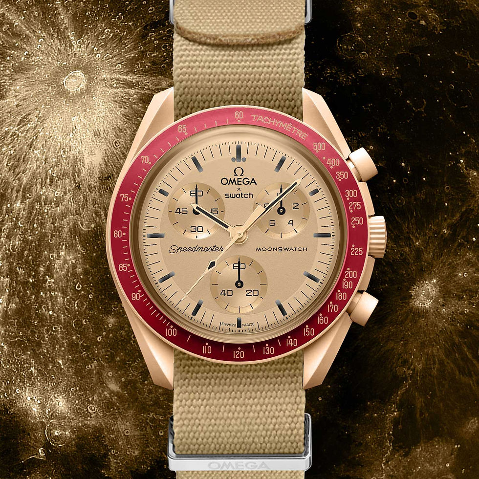
The Mission to Jupiter's sand brown and orange palette stands strong on its own merits, but gains additional enthusiast credibility through its nod to the limited edition Speedy Tuesday "Ultraman" Speedmaster from 2018. While the Mission on Earth Lava also references the Ultraman, Jupiter's execution proves more visually harmonious.
#9: Mission to Earthphase

As the most technically complex MoonSwatch to date, the Mission to Earthphase features both a moonphase display and an innovative "earthphase" display tracking Earth's phases as viewed from the Moon—possibly the first complication of its kind. Its monochromatic gray color scheme earns points for restraint, though it loses some functionality as the earthphase display replaces the 60-minute chronograph indicator, effectively reducing it to a 60-second chronograph.
#10: Mission to Uranus

Juvenile name jokes aside, the Mission to Uranus capitalizes on the ongoing fascination with Tiffany blue watches. While its pastel aesthetic might seem too youthful for some adult wearers, the comprehensive application of this trendy hue creates an unmistakable presence on the wrist.
#11: Mission to the Sun

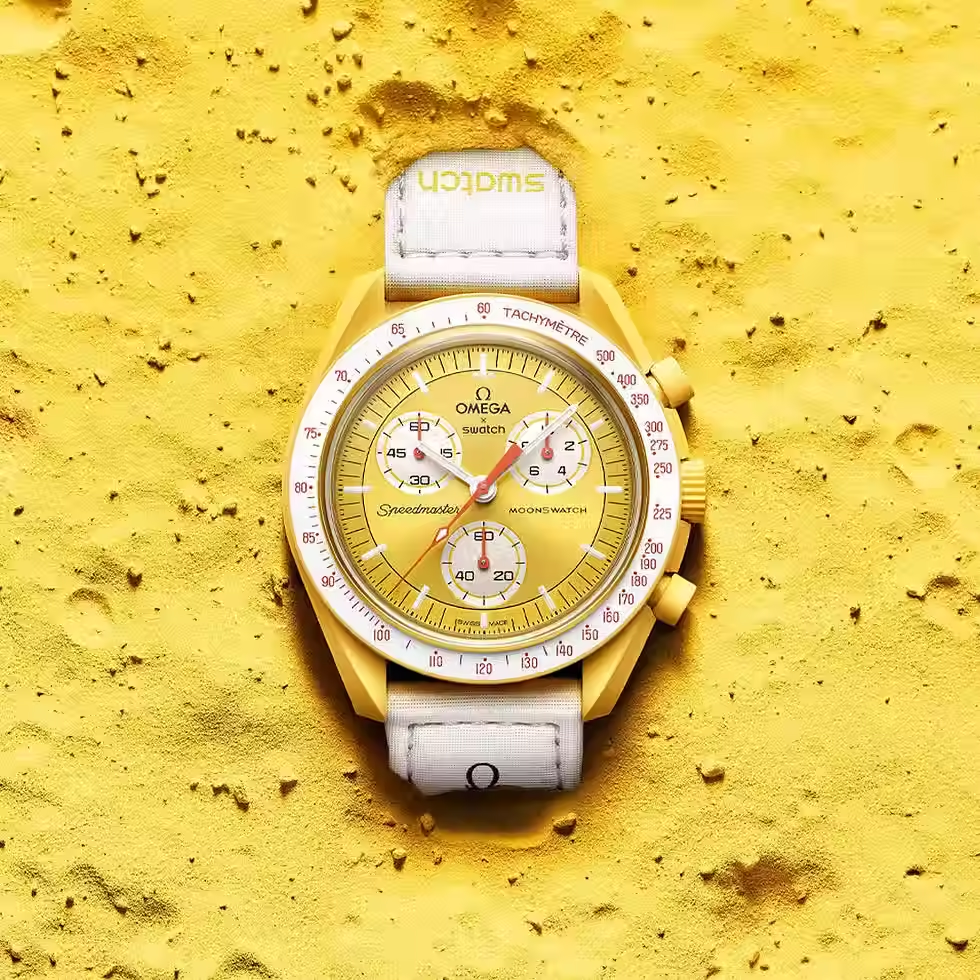
The Mission to the Sun earns its place through sheer chromatic confidence. As the most vibrant MoonSwatch, its yellow case refuses to be ignored. Though the concept of a mission to the Sun lacks astronomical logic, the watch's bold execution generates genuine visual heat.
The Middle Tier
#12: Mission to Neptune

While aesthetically pleasing, the Mission to Neptune is haunted by its troubled launch. Early production examples notoriously transferred blue pigment onto wearers' wrists, forcing Swatch to halt production and reformulate its blue Bioceramic compound. This quality control issue briefly drove Neptune prices to four-figure sums on the secondary market. Though Swatch has resolved the problem, the model still commands a premium—an odd legacy for the watch with staining issues.
#13: Mission to Mercury

The Mission to Mercury presents as a slightly tactical variation on the Mission to the Moon, adding a subtle gorpcore edge. While not unattractive, its muted palette verges on drab, albeit with military-inspired undertones.
#14: Mission to Saturn

The Mission to Saturn earns recognition for incorporating unique design elements—specifically the depiction of Saturn on its 6 o'clock sub-dial—but its otherwise subdued color scheme fails to generate excitement. Watch legend Roger Smith appreciates it, though, which counts for something.
#15: Mission to Pluto

Whether Pluto qualifies as a planet remains debatable; what's clearer is that among the similarly styled Mercury, Saturn, and Pluto models, the Mission to Pluto offers the least visual interest—perhaps a fitting parallel to its astronomical status.
The Disappointing Entries
#16: Mission on Earth

Moving beyond personal color preferences, the Mission on Earth suffers from fundamental conceptual confusion. Unlike other "Missions" to celestial bodies, a "Mission on Earth" lacks logical coherence—we're already here! Its combination of light green and dark blue also proves aesthetically challenging and difficult to integrate with most wardrobes.
#17: Mission on Earth Lava, Polar Lights & Desert

The 2024 Mission on Earth variants inherit the same conceptual weakness as the original while failing to introduce sufficient innovation. Though the Polar Lights model's aventurine-style dial shows promise, and the sub-dial design thoughtfully references the Speedmaster Alaska II and III projects, these releases arrived amid obvious "MoonSwatch fatigue." Our Instagram community poll confirmed this sentiment, with most respondents expressing disinterest—these variants simply didn't deliver enough originality to justify their existence.
Last Place: Mission to Venus

Despite distinctive elements like its unique bezel design and oval sub-dials (mirroring recent bejewelled Speedmaster 38mm models), the Mission to Venus falters through questionable color choices. This dusty pink shade lacks appeal, and its selection appears driven by gendered stereotypes rather than astronomical accuracy. Venus actually appears yellowy-white, not pink—this model represents the disappointing "shrink it and pink it" approach applied to MoonSwatches.
_________________________________________________________________________
What's your favorite MoonSwatch model? Do you agree with our rankings? Let us know in the comments below.


Comments